Borrower Refinance
Redesigning the refinance transaction with a modular design approach to future-proof the borrowing experience.

What is Maple?
Maple Finance is a Decentralized Finance (DeFi) platform that utilizes blockchain & smart contract technology to resolve lending and borrowing frictions, pain points, and inefficiencies.
The Problem
Borrowers can now modify more loan terms when they refinance. This provides users more flexibility but also complicates the user flow & refinance form.
My Role
I led the redesign of the Borrowing vertical by challenging the existing UX, UI, user flows, and user testing to build the best experience for borrowers.
I worked closely with the Product & Smart Contract team throughout design, collaborated with the Engineering team through hand-off & post-launch to ensure the best quality of our product.
The product launched globally on December 14th, 2022.


Design Vision
Future-Proofing the Refinance Transaction
The existing transaction was not designed to efficiently scale up as more loan terms were added. This provided us the opportunity to redesign the entire flow with the new design system to future-proof the refinance experience.

Before
After
Maple’s design process follows the conventional double diamond process, prioritizes creating the best UX whilst considering business and technical constraints to deliver the best quality of products.
Maple Design Process

Discover

What did the business want?


What did the borrowers want?


Define

Existing problems come from the first 2 steps of the user journey.
Based on a mix of existing testing data and UX audit, we came to understand that the major pain points come from the first 2 steps of the journey.


Information Inconsistent. More current loan terms (8) are shown than request new term input fields (4). There is an information disparity between the old vs new.

Poor Comparability. Current loan terms are displayed horizontally, but new terms are organized vertically, which makes it difficult to compare between old vs new.

Scaling Issue. When more loan terms can be modified, we need to add them to the screen. The current UI cannot afford to properly scale up.
1. Request Terms (Current Design):


No Holistic View on Loan. The Review screen provides only modified terms (3) and 4 other terms. Although the comparability is quite good, users would like to see all loan terms provided in one screen before submitting.
Poor Accessibility. The checkboxes in the Review column have poor contrast and unclear indicator to what has been reviewed. I found that low contrast reduces usability that led to losing trust to the product.
2. Review & Submit (Current Design):


Design Goals


We narrowed down to 3 design goals that we would want to accomplish in this version of the redesign after considering all business needs, technical constraints, and user needs.
Design

In this step we focused on redesigning the Request Refinance Terms screen and tackled several pain points based on prior user testing and feedback.

Design Goal 1: Easy Comparison
Break Down the Screen
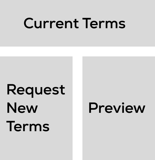
I tackled the design by identifying 3 key blocks of information on the screen: Current Terms, Request New Terms, and Preview. This helped me understand on a high level how I could approach the redesign with confidence.
Match Loan Terms
There are 8 loan terms displayed in Current Terms but only 4 input fields in Request New Terms. 4 current terms were eliminated, and the rest were reordered to match the input fields in Request New Terms.

Increase Comparability
The Current Terms are displayed horizontally but vertically for Request New Terms. This is an issue when we are adding new terms to the screen. Changing all categories to scale vertically makes it easy to compare.

1. Changing all categories to scale vertically
2. Increased comparability between both categories
Design Options and Iterations
With clear design patterns set, I began exploring thoughtful iterations that address visual hierarchy, comparability, transparency, and interactivity concerns.

Option 1
Start new design patterns with existing configurations. This is to test what works and what doesn’t. In this case, we can see that the Current Terms are too wide and take up unnecessary screen space, and the comparability between the current and new is compromised.


Option 2
Increase comparability and scannability between current vs. new. I matched the 2 categories side by side and switched the Current Terms as disabled input fields to allow equal spacing between the 2 categories. While this option is an improvement, the Preview Terms at the bttom now has the same issue as being too wide.


Option 3
An outside-the-box option. The thinking is because all the current vs new loan terms will be shown in the next step, we can provide only what need to be seen in this step - which are the modifiable loan terms. This gives the simplest design with users only needing to focus on one thing. We ended up not going with this option because we wanted to stick with familiar patterns for users.


Option 4
Scanning from left to right. This option strikes a great balance between showing what really matters to users in this step, as well as optimized comparability to scan from left to right in a logical sequence of information. This was a clear winner that we were excited to put into testing.
Maximize Screen Space, Minimize Scrolling
Minimize Scrolling. We discovered that users would lose context and the ability to compare information when scrolling was involved. Users were irritated or frustrated when they had to scroll back and forth substantially. A design pattern that can minimize scrolling can provide a better user experience.
User Testing
Maximize Screen Space. Through testing, we understood that users prefer to see more rather than less because it gives them a more holistic picture when digesting financial information. A design pattern that can leverage its width more than height will provide better user experience.


Design Goal 2: Holistic View on New Loan
In this step, we focused on redesigning the Submit Terms screen to provide a more holistic view to the loan before borrowers submit for a refinance request.
One More Step
The screen of this step only provides the modified terms and associated information but does not provide a holistic view of the entire loan prior to submission. For this reason, we explored adding another step in the flow.

Progressive Disclosure
In the next 2 steps, I updated the screen to first only show modified terms. Once reviewed and checked off, users will then see all loan terms in the final step. Disclosing more information to users as they progress through the task allows them to have a holistic view progressively without being overwhelmed.

Contextual Transparency
User Testing

A compelling insight we uncovered through testing was that a successful financial product needs to provide just the right amount of contextual information to users every step of the way. Users are overwhelmed when too much information is given, but lost and frustrated when too little is provided.This finding gave us confidence in the design approach we had been focused on.
1. Request new terms with current terms side by side. This screen provides just the fields of the terms that can be modified and the current terms that match them. A high-level preview of the refinanced loan gives users just what they need to proceed.
2. Review and acknowledge only the modified terms. In this step, users are asked to check all the terms that have been impacted by the new terms requested previously. This allows users to focus only on what will be changed in the new loan.
3. Review all loan terms before submitting. The final step provides all loan details in their entirety. By now users have gone through all modified terms, so this one last review is to give users a sense of transparency and security before submitting.

Design Goal 3: Scalable UX & UI
An essnetial part of the redesign was to implement the new design system. Below are a few ways of how I built the product with scalability in mind.
Scaling Separately
By separating current/new terms vs. preview into 2 different cards, we can now scale freely as more terms are added. For example, in the redesign, we had to add 2 more refinance terms but only 1 extra preview item. This design pattern gave us a flexible UI that can add or omit an uneven number of terms without issue.
Break Up Loan Details
A new feature added to Confirm Refinance Terms was the anchor tabs that segmented loan details into sections. This provides users a high-level overview and the ability to jump to a specific section when desired.

In the future, as more loan terms are added to the list, this UI pattern will also allow us to expand and segment into more sections without worrying about too much scrolling that could compromise the experience.
Deliver

Final Polish
Request Refinance Terms. The request refinance form now gives borrowers the ability to view current vs. new terms side by side. Once the new values are entered, a high-level preview of the new loan terms show up on the right side.
This design provides enhanced comparability, transparency, and scalibility to the product.
Review Terms. Borrowers can now easily go through each modified term, review, and acknowledge them one by one before proceeding.
This design provides just the right amount of information for them to digest without being overwhelmed.
Confirm & Submit Terms. In the final step, borrowers can freely choose to scroll through the entire loan or use the anchors to review by section.
This new feature allows them to mentally break up the information when there are hundreds of items to go through.