
Fly Through Security
A case study redefining airport digital wayfinding to better the traveler’s journey.
Type
Transportation
App Redesign
Duration
5 months, 2021
Team
Product Designer x2
Developer x4
Marketing x1
My Contribution
UX/UI Design
Product Strategy
01
OVERVIEW
CONTEXT
The most important mission at DFW Airport (Dallas Fort Worth) is to help travelers through all checkpoints.

BUSINESS GOAL
It is in DFW Airport’s financial interest to expedite travelers through security.
The faster travelers go through it, the more time they have to shop and dine.
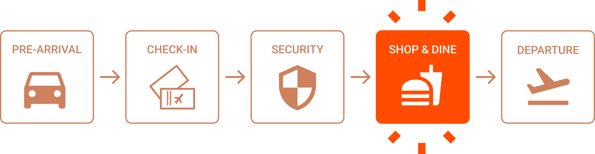
A Traveler’s typical airport journey

An ideal traveler’s airport journey for DFW:
PROBLEM
In the post-pandemic period, DFW Airport wants to better the airport experience for its travelers through digital solutions.
The current mobile app has tons of information but few are using it, and a simple heuristic evaluation exposes design weaknesses:
DESIGN CHALLENGE
How might digital solutions expedite the physical processes at the airport?
PROCESS
02
DEFINE PROBLEMS
86% of travelers only spend 45 minutes going through check-in & security, but arrive 2 hours early on average.
83% of the travelers use some form of digital service to aid their journey, but they are unaware of the existence of the app.
User interviews uncovered 2 insights in travelers’ journeys.
Insight 1:
Insight 2:
Insights revealed pain points we could capitalize on to create a better travel experience.


DESIGN OPPORTUNITY 1
How might we deliver timely information to travelers throughout their journey?
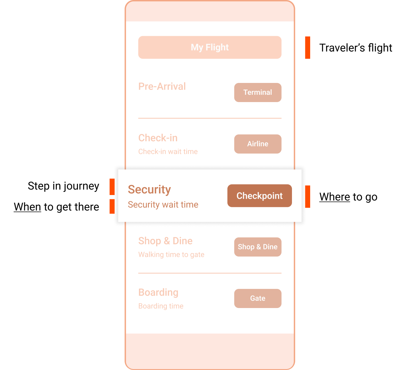
JOURNEY MAP
What travelers need to know is when they should get to where.
By listing out the destinations (where) and the time (when) it takes to get through each step, we identified what information we need to deliver to our travelers.

FRAMEWORK
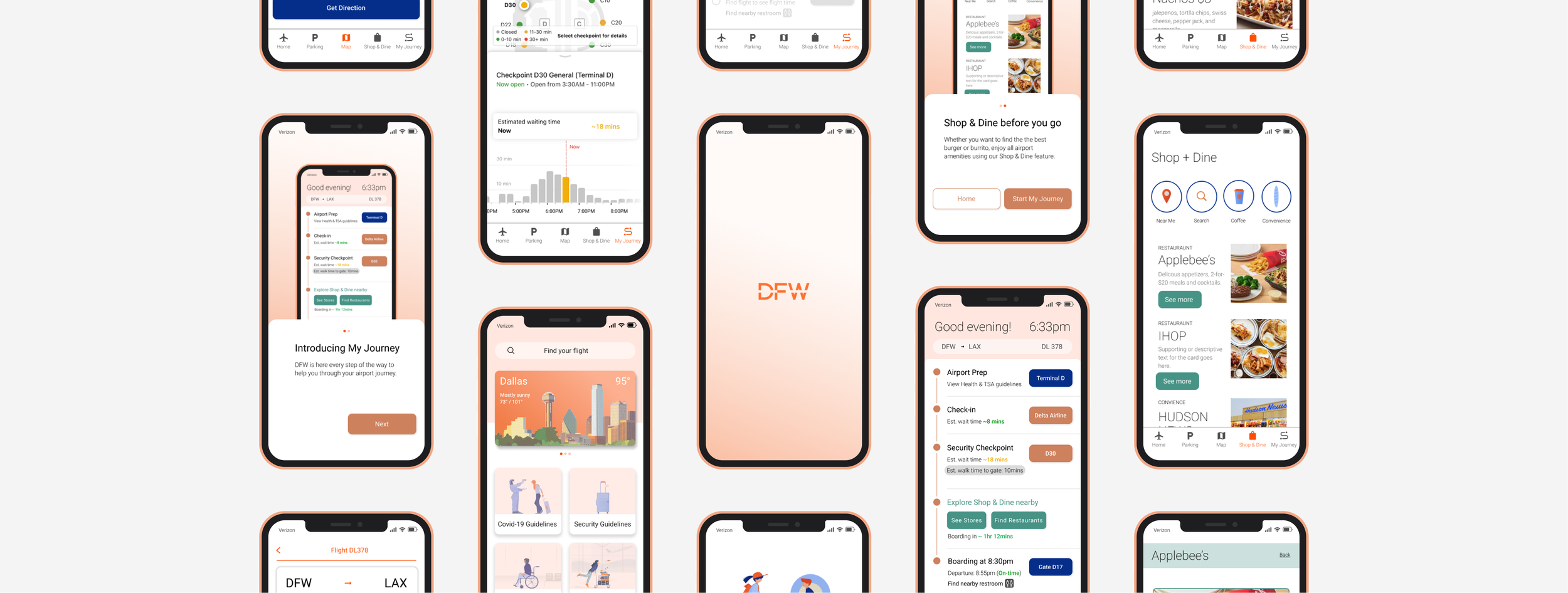
We created one single screen to display all the information travelers need throughout their journey.
By just accessing one single screen after entering their flight info, travelers can access all pieces of information they need throughout each step of their airport journey.
WIREFLOW
Because our user goal is to access timely information, we designed a flow as short as possible to get to My Journey with various happy paths.
Wireframes showing flow from onboarding to security wait time screen
Through onboarding, a primary CTA leads travelers directly to “My Journey”.
Through onboarding, a secondary CTA leads to home screen, which travelers can click on “My Journey” in Nav Bar.
Through onboarding, a secondary CTA leads to home screen, which has “Find My Flight”


SOLUTION 1
Digital wayfinding redefined.
An airport app that tells exactly what travelers need at each step of their journey.
If users can access timely information at each step of the journey, they will feel confident and empowered, instead of overwhelmed and stressed.
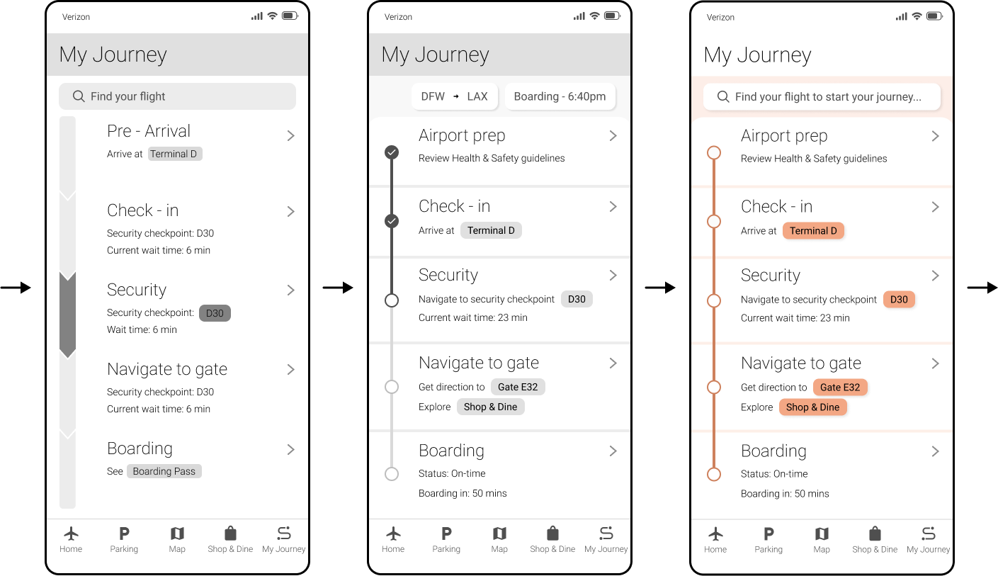
My Journey is an interface that would be able to provide the where and when information to our travelers once they add their flight info to it.

Before flight info added:
After flight info added:

Using My Journey:

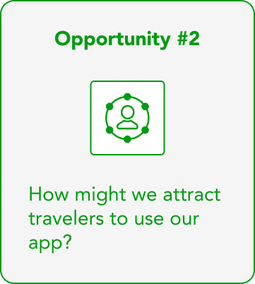
DESIGN OPPORTUNITY 2
How might we attract travelers to use our app?
MARKETING STRATEGY
We proposed to implement both digital and physical touchpoints by examining the business service blueprint.
83% of the travelers use some form of digital services to aid their journey, but they are unaware of the existence of the app.
We came up with two types of interactions that can help bring more travelers to the app:
Promote the app at all physical frontstage interactions at the airport such as airline counter, check-in kiosks, and digital banners throughout.
Utilize digital interactions through airport websites and confirmation emails sent from partnering airlines.
SERVICE BLUEPRINT
We need to collaborate with the marketing team to promote app in-airport with travelers on the go.
DFW Airport - Service Blueprint
Highlighted frontstage interactions promote airport app with a QR code to scan
A one-time incentive that promotes the app and encourages travelers to get through security quicker.
To create an inclusive design, we considered first time users most likely will be using while they are at the airport. To maximize the exposure, we can provide a one-time incentive for travelers to use at airport shop & dine. Not only will this encourage them to download the app, but also to get through security faster.
SOLUTION 2

03
MEASURING IMPACT
USER FEEDBACK
The initial design wasn’t intuitive, which led to rounds of iteration based on user feedback.
The first version wasn’t intuitive enough for 66% of the users. Upon 3 rounds of iteration and more user testing, 90.1% of the users were able to utilize My Journey without misclicks and responded positively to the feature.
Multiple Iterations of My Journey (wireframe to Hi-Fi):

We initially designed a horizontal scroll that broke up each step (with multiple screens).

2. After realizing how unintuitive the original design was, we redesigned the layout to a vertical progress bar displaying all steps on a single screen and arrived at this final screen.
04
NEXT STEPS
Breaking down information for users isn’t always better. People often prefer a more holistic view over a fragmented experience.
The initial design of My Journey was to break down each step of the journey into separate screens but proved that travelers prefer to have more information at once (a holistic view) instead of a fragmented experience. As a team, we learned to leverage Tesler’s Law (Conservation of Complexity) and came up with the final design.
WHAT I LEARNED
In our next step, we will secure buy-in from stakeholders with active collaboration and data-driven strategies.
Since part of our solution isn’t solely digital and would require partnerships with internal marketing team as well as external airlines, getting stakeholders to buy-in early on will ensure the project is feasible and can be rolled out on time.
STAKEHOLDER BUY-IN
We will next focus on developing how to further better traveler’s experience by integrating airport amenities into the app.
THE NEXT PROBLEM
